MicH89
pfffft
I don't really know is this the right place for this thread, but most of the activity is going on here.
I made my first proper personal logo in years (made my last proper logo design in 2007 I think). I was thinking about a logo which would suit to the style of my tracks. I decided to go with keywords: futuristic, urban, grunge, dirty. I'm going to use this logo as my "image" in sites like myspace.
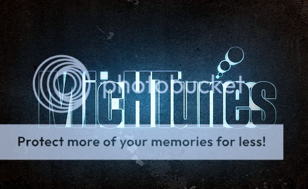
Made in photoshop cs3
I made my first proper personal logo in years (made my last proper logo design in 2007 I think). I was thinking about a logo which would suit to the style of my tracks. I decided to go with keywords: futuristic, urban, grunge, dirty. I'm going to use this logo as my "image" in sites like myspace.
Made in photoshop cs3
") Indeed the font could use some grungish masking but I fell in love with those smooth lines
Indeed the font could use some grungish masking but I fell in love with those smooth lines  But it also gives unique style to it.